- 15, May 2020
- #1
VCL Per-Control Style Coming in RAD Studio 10.4
Marco Cantu - 15/May/2020
VCL Per-Control Style Coming in RAD Studio 10.4
Marco Cantu
Among the many features Delphi 10.4 and C++Builder 10.4 are going to introduce for the VCL library, a small one with lots of nice side effects and use cases is the ability to have multiple active VCL styles within the same application.
In the past, the VCL library allowed a developer to select one style (or no style) for the entire application.
Starting with 10.4 the VCL library will allow you to use multiple VCL styles at the same time in different forms of your applications, or even different controls of the same form.
You can also mixed styles elements (controls and form) and elements using the Windows default platform theme.
This feature is controlled by a new StyleName property for the TControl class. This property takes as value the name of the one of the styles active for the application, and applies the style to the given control. If the property is empty, the parent control style is used: so if you set the property for a form, all controls in the form take the form style by default.
A Quick Demo
As the name implies, per-control styling allows a developer to apply different styles for controls and forms in the same application.
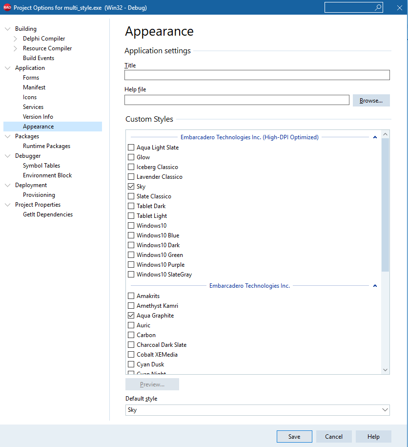
To start, you need to add multiple styles to an application, and you can use all of them.
This feature works only if one of the VCL Styles is active.
First, add multiple styles to an app (hint, in 10.4 you can use the new high-dpi styles, that's for another blog post):

Now set different styles names for different controls in a form, like in the following DFM file (I kept only key relevant properties here):
object Form2: TForm2
StyleName = 'Sky'
object Panel1: TPanel
StyleName = 'Light'
object Button1: TButton...
object Button3: TButton
StyleName = 'Sky'
end
end
object Button2: TButton
StyleName = 'Windows'
end
object Button4: TButton
StyleName = 'Luna'
end
object Button5: TButton
StyleName = 'Aqua Graphite'
end
end
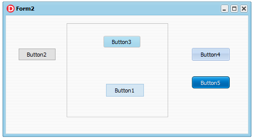
Notice that Button1 takes the hosting panel style, while Button2 resets the style to the form one. Finally, 'Windows' is a special purpose value, as described below. With this code, here is the UI of a form with 5 buttons using 5 different styles:

A Few Rules
There are different approaches you can use to to adjust the style of the different forms and controls of a VCL application:
1. Adjust style list in project options (but you can also load styles at runtime).
2. Use the TControl.StyleName property to define the specific style for each control or each form.
The StyleName value must be one of the names of the styles in the project options.
A control can use the StyleName defined for its parent control, so you can set the StyleName property of a form to have specific style used by all controls on it. Additional cases:
3. You can define a specific style also for common dialogs. Use the property TStyleManager.DialogsStyleName for that. By default, it is empty and common dialogs use the default style of the application.
4. You can define the application style as 'Windows'. This means that if some control or form has an empty StyleName property, then it will always use 'Windows' style and VCL Style will be always disabled on it. To enable this feature you have to set the TStyleManager.UseSystemStyleAsDefault property to True.
Use this property if you want to enable VCL Style for some forms only, in which you set StyleName property.
But note that VCL Styles must be active in any case.
The mechanism described at point 4 above allows a developer to use third party components that don't support VCL styles within a styled application, something that was fairly complex to handle in the past.
The new architecture should allow mixing styled and un-styled controls and form better, and leverage third party controls without giving up VCL styles
Notice that per-control styling is not applied automatically for third-party controls. To support this feature, a control should use code in Vcl.Themes.StyleServices method with TControl parameter. For example, StyleServices(Self).DrawElement.
Conclusion
The introduction of per-control VCL styles offers you much more flexibility in introducing styles in your application.
You can start styling only some of the forms, and proceed over time with others.
You can use your own custom controls or third-party controls that don't support VCL styles within a styled application.
You can mix UI styles, and do so dynamically.
While there are going to be many other features for VCL in general and VCL styles in particular in 10.4, this is a great new feature I felt worth blogging about up front. Stay tuned for more (and also nicer demos!).
If you have update subscription, one of the perks is accessing beta builds of upcoming releases. There's still time to join our beta program for 10.4!
This is a preview of an upcoming release of RAD Studio. There can always be last-minute bugs or changes. Nothing here is final until the release is officially made available.
VCL Per-Control Style Coming in RAD Studio 10.4
Marco Cantu
Among the many features Delphi 10.4 and C++Builder 10.4 are going to introduce for the VCL library, a small one with lots of nice side effects and use cases is the ability to have multiple active VCL styles within the same application.
In the past, the VCL library allowed a developer to select one style (or no style) for the entire application.
Starting with 10.4 the VCL library will allow you to use multiple VCL styles at the same time in different forms of your applications, or even different controls of the same form.
You can also mixed styles elements (controls and form) and elements using the Windows default platform theme.
This feature is controlled by a new StyleName property for the TControl class. This property takes as value the name of the one of the styles active for the application, and applies the style to the given control. If the property is empty, the parent control style is used: so if you set the property for a form, all controls in the form take the form style by default.
A Quick Demo
As the name implies, per-control styling allows a developer to apply different styles for controls and forms in the same application.
To start, you need to add multiple styles to an application, and you can use all of them.
This feature works only if one of the VCL Styles is active.
First, add multiple styles to an app (hint, in 10.4 you can use the new high-dpi styles, that's for another blog post):

Now set different styles names for different controls in a form, like in the following DFM file (I kept only key relevant properties here):
object Form2: TForm2
StyleName = 'Sky'
object Panel1: TPanel
StyleName = 'Light'
object Button1: TButton...
object Button3: TButton
StyleName = 'Sky'
end
end
object Button2: TButton
StyleName = 'Windows'
end
object Button4: TButton
StyleName = 'Luna'
end
object Button5: TButton
StyleName = 'Aqua Graphite'
end
end
Notice that Button1 takes the hosting panel style, while Button2 resets the style to the form one. Finally, 'Windows' is a special purpose value, as described below. With this code, here is the UI of a form with 5 buttons using 5 different styles:

A Few Rules
There are different approaches you can use to to adjust the style of the different forms and controls of a VCL application:
1. Adjust style list in project options (but you can also load styles at runtime).
2. Use the TControl.StyleName property to define the specific style for each control or each form.
The StyleName value must be one of the names of the styles in the project options.
A control can use the StyleName defined for its parent control, so you can set the StyleName property of a form to have specific style used by all controls on it. Additional cases:
- By default, TControl.StyleName is empty and control uses a default style.
- You can set StyleName as 'Windows' to disable applying any style for control or form.
- If you set a style name that is not among the loaded VCL styles, then the control will use default style.
3. You can define a specific style also for common dialogs. Use the property TStyleManager.DialogsStyleName for that. By default, it is empty and common dialogs use the default style of the application.
4. You can define the application style as 'Windows'. This means that if some control or form has an empty StyleName property, then it will always use 'Windows' style and VCL Style will be always disabled on it. To enable this feature you have to set the TStyleManager.UseSystemStyleAsDefault property to True.
Use this property if you want to enable VCL Style for some forms only, in which you set StyleName property.
But note that VCL Styles must be active in any case.
The mechanism described at point 4 above allows a developer to use third party components that don't support VCL styles within a styled application, something that was fairly complex to handle in the past.
The new architecture should allow mixing styled and un-styled controls and form better, and leverage third party controls without giving up VCL styles
Notice that per-control styling is not applied automatically for third-party controls. To support this feature, a control should use code in Vcl.Themes.StyleServices method with TControl parameter. For example, StyleServices(Self).DrawElement.
Conclusion
The introduction of per-control VCL styles offers you much more flexibility in introducing styles in your application.
You can start styling only some of the forms, and proceed over time with others.
You can use your own custom controls or third-party controls that don't support VCL styles within a styled application.
You can mix UI styles, and do so dynamically.
While there are going to be many other features for VCL in general and VCL styles in particular in 10.4, this is a great new feature I felt worth blogging about up front. Stay tuned for more (and also nicer demos!).
If you have update subscription, one of the perks is accessing beta builds of upcoming releases. There's still time to join our beta program for 10.4!
This is a preview of an upcoming release of RAD Studio. There can always be last-minute bugs or changes. Nothing here is final until the release is officially made available.

